Content links
An Interface for the WWW
Information Space
The GUI
The Desktop
Usability
Beyond the Desktop
Discussion
References
The Interface
An Interface for the WWW
In its broadest sense, a Human-Computer Interface (HCI) design should take into account not only the computer software—operating system or application—but also the physical devices that allow access to and manipulation of the software objects. However, as with the section on access for those with disabilities, an investigation into the issues surrounding these physical devices is considered to be beyond the scope of this discussion. It will be assumed that the standard input devices—mouse and QWERTY keyboard—are being used.
Further, designing an interface for the WWW is itself a particular subset of the HCI discipline. As we have seen in the section on WWW languages, web pages are 'dynamic' in the sense that they are built anew each time a user accesses them. That is, they exist on a server (somewhere) as an algorithm, a set of instructions to build a page, not as a page fixed in the way a printed page is fixed. Depending which browser the user has installed the interface may look and behave differently. It may even be that different versions of the same browser will not behave consistently. On top of this, the interface designer has no knowledge about the operating system being used. In theory this should not be an issue—it is the job of the browser to act as go-between—but it is well known that crucial variables like font size and colour mapping vary significantly between Mac- and Windows-based machines. In other words, a WWW interface runs within an application of unknown type and version—the browser—itself running within an operating system of unknown type and version.
There are ways of overcoming these uncertainties, and it is quite common to find interfaces designed in Flash or Director that 'take over' the browser when loaded, allowing the designer absolute definition and control of the web site. However, interfaces designed this way inevitably introduce other problem areas: download time; access for adaptive software; hypertext linking; bookmarking; saving; printing.
The other major problem is the sheer scale of the information space on the other side of the WWW interface…
Information Space
It would seem that we humans find it very easy to think about things visually, to think about things spatially. We are good at remembering pictures, recognising faces. When we say we understand something, we 'see' it. We talk in terms of phase spaces, data clouds, hierarchical trees, and of visualising problems. The advent of the computer has brought us fractal landscapes, electron density maps, fMRI, and PET scans. We can see a pyramid of germanium atoms, or a single oxygen atom sitting on top of a gallium arsenide lattice. Not only that, but we can now pick up our MIDI files, drag them across our desktops and put them in the trash. We can redraw sounds with our pencil. And, finally, we can navigate cyberspace, surf the web, and end up talking to a complete stranger in a chatroom.
This facility we have to think spatially was first recorded in a story found in Plato [1] although it has been quoted by Cicero, Quintillian, and many others since [2,3,4]. One of the Dialogues concerns a poet named Simonides who had been hired to perform at a feast. Part of the 'storytelling' will involve him expounding upon the feats of the guests, whose identities he memorises using their places at the table as an mnemonic. Sometime towards the end of the evening he is called outside, at which point the building collapses (!): as the only survivor he is able to identify all the mangled bodies because of their position around the table. This type of mnemonic device has been widely reported subsequently, certainly up to the "memory palaces" of the Renaissance.
However, this type of explicit memory mapping is one limited aspect of the human disposition for visualisation. Religious architecture—from the Pyramids through Gothic cathedrals up to La Sagrada Familia—has always been explicitly used to embody symbolic systems. A good example is the Arena Chapel in Padua. The interior is completely dominated by a series of frescoes painted around 1305 by Giotto. Three layers of images circle the walls. Spiralling down from the top left corner of the right-hand wall these paintings form a narrative relating the Christian story [5]. Each frame tells a little story of its own, often presenting figures in trompe l'oeil three-dimensional spaces. In a world still largely without literacy, the inside of the chapel is a picture book. One cannot help but think of this in terms of modern technology: together, the frescoes look like a story board for a film, but individually each is like an episode from a soap opera. There is a cast of characters, a narrative: but we might even suppose that viewers may have referred to first one picture, then another, perhaps jumping back to one earlier in the sequence, as we do with hypertext. Further, Beck [6] makes clear the close collaboration between Giotto and the composer Marchetto during the creation of these frescoes: surely immersed within these spaces with their specially written music, lighting, incense, and ritual, these medieval churches must have been a mind-blowing experience for the worshipper. Truly a multimedia extravaganza.
It is widely assumed that in the middle of the 15th Century Johann Gutenberg invented movable type. Whilst it is certainly true that he brought this technique to the West there is evidence that it had been in use in China and Korea since the 13th Century [7]. Whatever, the introduction of printing was to completely revolutionise society. It is difficult now to imagine a world before books. Yes, books did exist, but in the scribal era these would have been expensive, time consuming, hand-made objects: even scholars may have possessed only a handful. Outside of the Church, very few people would have been able to read or write: ideas, inventions, thoughts, techniques, were passed down through the generations orally, or simply forgotten. Because so much was passed down this way—you could only pass on knowledge to someone in your presence—ideas spread very slowly.
Printing allowed all human knowledge to be stored, not just that of an elite few. For the first time, a relatively inexpensive means for publishing and disseminating information came into being. A book may not be as permanent as a clay tablet, certainly, but mass production assured the longevity of the information it contained. The printed page became a space where ideas, poetry, political thought, diagrams, and formulae could all coexist equally. The coming of the book instigated a process of cultural transformation that is still going on today.
Central to this was Bacon's idea about the observability of physical phenomena and the coming into being of the scientific method [8]. This laid the ground for Copernicus, Kepler, Galileo, and finally Newton to completely reshape our view of the physical space around us and our place within it. The accurate representation of three-dimensional spaces on two-dimensional surfaces became possible with the use of perspective. Later, with the onset of the industrial revolution, new means of transport and communication came into being further challenging our sense of space. The physical world began to shrink [9]:
"Education spread at different rates, as Gutenberg's invention brought books and knowledge within the reach of ever-widening sectors of society. Books promoted economic progress through the diffusion of practical skills and scientific discovery. It was through printed books, for example, that Columbus came to know that the world was round and that India could be approached from a westerly direction as well. Books accelerated the development of learning. All progressive ideas took advantage of printing."
By the beginning of the 20th Century photography, film, radio, and audio recording—the electronic media—allowed new forms of expression, new means of representation, and new ways to store information. As the visible world had been shrinking, an invisible world of electromagnetic spectra and quantum events had appeared. New conceptions about space and time were reflected in the arts: the multi-dimensional facets of cubist painting; the discontinuous time and multiple perspectives of Eisenstein's cinema; the sophisticated primitivism and dissonance of Bartok, Stravinsky, and VarU`se; the frenetic syncopations of jazz. By 1945 the work of Turing, von Neumann, and Shannon had laid the theoretical foundations for the modern world of computing, and in that same year Vannevar Bush published his seminal As We May Think article [10].
Bush was originally an electrical engineer, and after a long spell teaching at MIT—where he became Dean in 1932 and eventually Vice-Principal—he ended up coordinating the US scientific effort during WW2 as head of the Office of Scientific Research and Development [11,12]. As We May Think is crucial for two main reasons. Firstly, it makes explicit a new problem:
"There is a growing mountain of research. But there is increased evidence that we are being bogged down today as specialization extends. The investigator is staggered by the findings and conclusions of thousands of other workers ? conclusions which he cannot yet find time to grasp, much less to remember, as they appear. Yet specialization becomes increasingly necessary for progress, and the effort to bridge between disciplines is correspondingly superficial."
In other words, in the 500 years since the introduction of movable type into the West, we had gone from a state of illiteracy and information starvation to its complete opposite. Even in 1945 Bush recognised that the biggest hurdle to progress and understanding was information glut. Even within a single discipline there may be innumerable avenues of research, each of which may legitimately occupy a lifetime of work. How then to stay abreast of other developments within that one discipline, let alone make sense of them. Being limited in this way misses completely the synergies possible from a multi-disciplinary approach, and it can also be very wasteful in terms of repetition of effort:
"This is a much larger matter than merely the extraction of data for the purposes of scientific research; it involves the entire process by which man profits by his inheritance of acquired knowledge."
As a means of addressing this issue—this being the second reason his article is so important—Bush proposed a machine called a Memex. The technological implementation is outdated and not really that important, it's the ideas that count:
"If the user wishes to consult a book, he taps its code on the keyboard, and the title page of the book promptly appears before him, projected onto one of his viewing positions."
"It affords an immediate step, however, to associative indexing, the basic idea of which is a provision whereby any item may be caused at will to select automatically and immediately another."
"Moreover, when numerous items have been thus joined together to form a trail, they can be viewed in turn? It is exactly as though the physical items had been gathered together from widely separated sources…"
Central to the Memex is this idea of creating trails whose path mimics the associative workings of the brain, that can reflect a train of thought, a stream of consciousness:
"With one item in its grasp, it snaps instantly to the next that is suggested by the association of thoughts, in accordance with some intricate web of trails carried by the cells of the brain."
Clearly Bush is describing some internet-like device. Although the technology was not available at the time, the ideas contained within this paper continued to reverberate within US academic circles for many years. A direct line of inheritance can be traced from Bush through Norbert Wiener to J.C.R Licklider and into the ARPANET project (which as we have seen mutated into the WWW itself).
Another to fall under its influence was Doug Englebart. His work has its source in his wartime experiences as a radar operator, where he became very aware of the power of the Cathode Ray Tube (CRT) to display information dynamically [13]. Subsequent exposure to the work of Bush and Licklider led to the publication in 1962 of his paper Augmenting Human Intellect: A Conceptual Framework [14]. This paper is a detailed proposal for the creation of a computer system that will explicitly improve the effectiveness of the human operator, 'augment' the intellect of the user:
"The biologists and physiologists use a term "synergism" to designate (from Webster's Unabridged Dictionary , Second Edition) the "…cooperative action of discrete agencies such that the total effect is greater than the sum of the two effects taken independently…" This term seems directly applicable here, where we could say that synergism is our most likely candidate for representing the actual source of intelligence."
In order to achieve this, Englebart realised that the point where the user and the computer system met—the interface—would be crucial to the effective operation of the system. How would they communicate with each other? His thinking developed around what is normally called the Whorf-Sapir hypothesis, which states that the expressive range of a culture is limited by the language it uses [15,16]. Englebart extends this:
"Both the language used by a culture, and the capability for effective intellectual activity are directly affected during their evolution by the means by which individuals control the external manipulation of symbols."
In other words, the expressive range of a culture is extended or amplified by the tools it uses, by its technologies. The use of these tools allows for the extension of the intellect into otherwise inaccessible domains. Clearly there is at least some truth in this 'Neo-Whorfian Hypothesis', as Englebart calls it. Simply from the examples I have used we can see how fMRI scanners allow us to look at activity within the brain; how books allow us to store our memories and experiences beyond a natural lifespan; how the telescope allowed Galileo to see the pock-marked surface of the moon [17]; etc..
Within his paper Englebart illustrated these ideas with a scenario whereby an 'augmented architect' is using something very much like a CAD/CAM product. The user manipulates an onscreen model of a building with his 'pointer'. He draws up files and data from other sources and integrates this new data into the model: the screen updates the image. He can store it, share it, publish it. Considering this was written at a time before computers generally had screens at all—let alone those showing 3D models—this is truly a remarkable vision. The Graphical User Interface (GUI) was invented by Doug Englebart.
The GUI
Working at Stanford Research Institute (SRI), Englebart went on to develop working computer systems, culminating in the Augment workstation. This was shown publicly for the first time in December 1968 [18]:
"…Englebart's show electrified the crowd. They had seen nothing like it before, and many of them would have to wait years to see its equivalent again. The luminous new world of information-space had suddenly come into view, and it was clear that the future of computing had been changed irrevocably."
For the first time windows were seen publicly. The display could be split up into distinct areas, each showing different subsets of the information: graphics in one window, a list of coordinates in the other. It was even possible to 'cut a hole' in the screen to bring up some other data [19]. Perhaps the most startling external manifestation of the new system was the mouse. Although the Augment mouse looked like a small brick, its use allowed for the first time the direct manipulation of onscreen objects. This completely dispensed with the necessity for command-line interfaces—time consuming, error prone, and requiring a considerable mental investment by the user—and allowed a sense of immediacy, directness, and involvement with the onscreen representations.
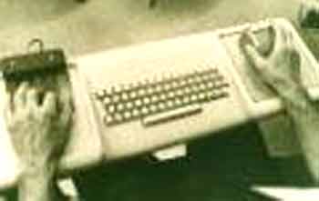
Fig.16: The actual keyboard, 3-button mouse, and keypad used during the 1968 Fall Joint Computer Conference [20].
Unfortunately, funding for the Augment project was withdrawn in 1970, although Englebart remains active and true to his original vision [21].
Alan Kay and Ed Cheadle had actually been working on a very similar project at the University of Utah at the same time as Englebart was putting the Augment project together [22]: by 1967 a working model of the FLEX system was in operation. It had a high-resolution display that allowed multiple windows, and used something like a graphics tablet as a pointing device. It even had icons, which in this case were limited to graphic representations of user-created documents. Despite these advanced features it never really worked properly [23]:
"And of course it had a "user interface", but one that repelled end users instead of drawing them closer to the hearth."
Kay went on to the newly-formed Computer Science Laboratory (CSL) at Xerox PARC. Other scientists had come from working with Englebart and the now-defunct Augment project at SRI. Their first major project became the Xerox Alto. The Alto was part of a larger scheme at Xerox to develop a new range of computing products for business. The existing paradigm of many users time-sharing a single mainframe computer was to be superseded. In its place, Xerox envisaged workers using dedicated workstations networked together via their new Ethernet protocol. Consequently, the Alto CPU came on wheels and was designed to be pushed under a desk. It had an integrated Ethernet connection, a removable hard drive, and a mouse. The screen was what we would now call a portrait display; that is, like an upright sheet of A4 [24,25]. What's more, this screen was of a completely new type, a bitmapped display.
Previously computer screens had been only able to display lines of characters drawn from a fixed set. However a bitmapped display is based on a grid of picture cells, or pixels. On a greyscale monitor—such as that used on the Alto—the binary values 1 and 0 simply switch the pixels to either black or white. The more bits used to represent each pixel, the more colours it becomes possible to display: an 8-bit number allows 256 possible colours to be represented, for example. Although a bitmapped display puts greater demands on the computer processor, it allows for a far wider range of font types and sizes, symbols, photographic images, and, most importantly, movement.
This new type of display had been fully exploited by Kay. The interface had windows, sure enough, but these could now overlap. It became possible to have several windows open at once, and whichever one was on top was the one you worked on. It had depth [26]:
"The bitmapping revolution had given us a visual language for information, but Kay's stacks of paper suggested a more three-dimensional approach, a screen-space you could enter into. The whole idea of imagining a computer as an environment, a virtual world, comes out of this seemingly modest innovation, although it would take many years for that legacy to become visible."
Kay has described some of the ideas that helped shape his work in these new graphical environments. Firstly, he was influenced by Marshall McLuhan's Understanding Media [27]:
"What McLuhan was saying is that if the personal computer is truly a new medium then the very use of it would actually change the thought patterns of an entire civilisation. […] But it also promised to surpass the book to bring about a new kind of renaissance by going beyond static representations to dynamic simulation. What kind of a thinker would you become if you grew up with an active simulator connected, not to just one point of view, but to all the points of view of the ages represented so they could be dynamically tried out and compared?"
Not only does this correlate very strongly with Englebart's ideas, but Kay makes explicit here the enormous potential of this new medium for education. This became a core idea in his work when, after reading McLuhan, Kay was exposed to the work of MIT researcher Seymour Papert and his work in schools with the LOGO programming language [28]:
"The work of Papert convinced me that whatever user interface design might be, it was solidly intertwined with learning."
This in turn led him to the work of Piaget and, more importantly, Bruner. Specifically, in Towards a Theory of Instruction Bruner describes three mental modes used in learning [29]:
-
Enactive mode. We learn by doing. Manipulation.
-
Iconic mode. Knowledge about the domain gained through practice is organised and structured.
-
Symbolic mode. Rules are abstracted from the structure.
Clearly this model itself owes something to Piaget's work on child development, but whereas Piaget saw the child moving progressively through these modes—leaving the others behind, now obsolete—Bruner sees them as being both inclusive and as relevant to adults as to children. In fact Bruner sees mastery as being achieved only when all three of these cognitive modes have been brought to bear on a domain. For Kay, this model of learning behaviour provided the theoretical underpinning to his creation of an interface that is essentially a learning environment. He says [30]:
"Now, if we agree with the evidence that the human cognitive facilities are made up of a doing mentality, an image mentality, and a symbolic mentality, then any user interface we construct should at least cater to the mechanisms that seem to be there. But how? One approach is to realize that no single mentality offers a complete answer to the entire range of thinking and problem solving. User interface design should integrate them just as well as Bruner did in his spiral curriculum ideas."
In practice, these ideas become embodied in the following way:
-
Enactive: a mouse allows direct manipulation of iconic objects.
-
Iconic: These icons in turn reveal the underlying structure of the data (which we could initially see as a hierarchy represented by files, folders, and volumes).
-
Symbolic: Represented by a programming language or other authoring tool.
The Alto interface, then, is missing this final 'symbolic' stage, and it is in this direction that Kay's work progressed. He went on to develop a programming language called Smalltalk, which although never released into the market was used extensively at Xerox PARC [31]. After a stint at Atari, Kay—like so much else from Xerox—ended up at Apple.
The Desktop
The Alto became operational in 1972. It never became commercially available, although over a thousand were used inside Xerox [32]. It wasn't until April 1981 that Xerox finally did release a product for public consumption: the 8010 'Star' system.
Like the Alto, the Star was designed as part of a suite of compatible Ethernet-connected devices: file servers, the newly-developed laser printer, etc.. Eight years of software development on the Alto were incorporated into the Star's operating system and applications [33]. The operating system represented itself to the user as a virtual desktop. There were drop-down menus, icons, and multi-tasking was allowed. Applications presented data in the now-familiar WYSIWYG style. A word processor, paint and drawing programs, a table generator, a personal database, and an electronic mail application all came bundled with it [34]. It had page-description languages and allowed work-flow based computing [35]. Not only that [36]:
"The set was fixed, always loaded, and automatically associated with data files, eliminating the need for users to worry about obtaining, installing, and starting the right application for a given task or data file. Users could focus on their work, oblivious of concepts like software, operating system, applications, and programs."
It sounds incredible! Needless to say that upon its release the Star was a complete flop. Some put this down to a mixture of cost—one Star plus printer would cost about US$60,000 in todays money—and the fact that it was a closed and proprietary system [37]. Norman cites cost, but describes serious operational flaws due to the lack of raw processing power [38]:
"The Xerox Star computer was a breakthrough in usable design. But the system was too expensive and too slow. Users liked the power and the ease of operation, but they needed better performance. The benefits of easy to use commands were completely outweighed by the slow response speed. The display could not always keep up with typing, and requests for explanation (the "help" system) sometimes took so long that a user could go for a cup of coffee while waiting for an answer to even the simplest question. Xerox showed the way but suffered a common fate of pioneers: the spirit was willing but the implementation weak."
(A detailed look at interface development in terms of 'pioneer vs settler' systems is in [39]. It includes much discussion of the Star.)
Despite the failure of Xerox to achieve commercial success with the Star, the work being done at the Computer Science Laboratories had already escaped into the wider world. In December 1979 Apple founder Steve Jobs had been given a tour of Xerox PARC and had seen the Alto in action [40]. Within days he had specified a new machine, virtually identical to the Alto in terms of capabilities, that would become the Apple Lisa. This in turn would become the Macintosh. Despite a long period where the GUI and its prevailing desktop metaphor would struggle to find acceptance [41], it was eventually grafted on top of the market-dominating MS-DOS operating system to become Microsoft Windows. Other desktop-like GUIs have appeared as front-ends for Unix (Unix 'shells'); the Atari TOS operating system; and on the Amiga and NeXT computer systems. Surely most computer users know nothing else but the desktop metaphor.
Usability
As well as bestowing upon the world the dominant computer interface paradigm for the last 20 years, the Star remains important in another, perhaps less obvious, way: the reason the interface turned out the way it did is largely due to the innovative design process that produced it.
The standard product development cycle of the industrialised West is a linear process: from specification through design, manufacture, test, sales, and delivery. This is often called the waterfall process, because each department hands on the project to the next. Once you're 'over the waterfall' there's no going back [42,43].
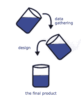
Fig.17: The waterfall design process [44].
One of the major problems with this is that user testing comes far too late in the cycle, and often becomes a matter of implementing superficial 'fixes' to flaws deep in the product.
Another way of designing a product—used consciously by the Star development team—is iterative design. After the initial specification has been drawn up a prototype is immediately built: this is then tested on users. The information gained at this stage is then fed back into the design and a new prototype is built. Subject this new version to user testing, etc.. The design process becomes a cyclic and (obviously) iterative movement towards some theoretical ideal product.
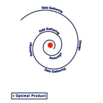
Fig.18: Iterative design process [44].
On the Star, the testing regime was extensive and permeated every aspect of the system: the number of buttons on the mouse; the form of the end-user programming language; the decision whether to employ tiled or overlapping windows; icon design; etc. [45]. However, it is not enough to simply 'decide' to design something iteratively rather than in a linear fashion: these design processes reflect organisational cultures, social structures within the parent body. Norman points out that linear design processes are often the product of hierarchical organisational structures, where communication channels are optimised vertically. A successful product design, however, would benefit from horizontal communication between the different departments [46]:
"A fundamental conflict exists between the traditional vertical organization of most companies and the functional, horizontal structure required to deliver products. Not only is the vertical structure inimical to product development, but it leaves no place for functions that cut across the structure, functions such as usability, reliability, maintainability."
In practice, of course, it is possible to create effective design procedures within hierarchical structures—as Norman goes on to discuss [47]—but this will typically require a conscious decision by management to create the necessary conditions. This is exactly what happened at Xerox, where PARC existed as a self-contained unit under the direct control of Bob Taylor (who had been Licklider's successor at ARPA) [48]:
"To accomplish so much so fast, Taylor created a flat organizational structure; everyone who worked at CSL, from scientists to secretaries, reported directly to Bob Taylor. There were no middle managers."
As a final word on this, it is interesting to point out that this effect—organisational structures constraining the product design process—is very similar to the tendency to have these same structures unwittingly reproduced within the information architectures of web sites as was previously discussed in the essay on Information Architecture.
As a necessary condition of the extensive user testing carried out on the Star project, the researchers at Xerox PARC incidentally created the first body of literature on HCI analysis actually based on observable behaviour. Much of this eventually surfaced in Card, Moran, and Newell's seminal The Psychology of Human-Computer Interaction of 1983. Largely within the context of text editing, this describes a system whereby a user is given specific task. This in turn is meticulously broken down and analysed in terms of the GOMS model, sometimes called the keystroke model [49]:
-
Goals. An end result to be achieved by the user such as a specific editing task. There may be several ways to achieve this goal.
-
Operators. Sets of elementary actions needed to reach the goal. These can be cognitive, motor or perceptual acts: moving the mouse; get next page; make a decision; etc..
-
Methods. As most computer users know, there may be several ways to achieve a task using combinations of the mouse, control keys, and key commands. Clearly, some will be more efficient than others.
-
Selection. A set of rules for predicting the most efficient route to task completion from any given state.
Embedded within this are a set of other observations about human performance, for example [50]:
-
Fitts Law. Allows a calculation to be made about the time to move a mouse pointer (say) to a target, based upon distance and size of the target.
-
Power Law of Practice. A commonly observed effect whereby users acquire skills through practice. Time decreases exponentially: that is, the time taken to do a task decreases quickly and then flattens off. Theoretically users will always improve, but only marginally.
-
Hicks Law. Put simply, decision time increases as complexity increases.
There are other, more complex variants of this basic GOMS model, but the point is this: it allows a scientific and quantitive basis for decisions to be made about interfaces. Atwood, Gray, and John [51] describe real-world example of this kind of technique in use. They had been hired by telecoms company NYNEX to assess a new GUI-based system they were thinking of purchasing. The question was: would the new interface prove operationally quicker than their current text-based interface? A three month evaluation process took place in which detailed metrics were gathered about the telephone operator's performances on the new and old systems. Parallel to this, they were able to create a predictive model using Critical Path Method-GOMS (CPM-GOMS). The model predicted that the new GUI would in fact be slower than the old system—despite assurances to the contrary from the vendors—and the test data eventually proved that prediction correct. For NYNEX, this knowledge was crucial, for they estimate that each second gained or lost costs US$3 million per operator per year!
Clearly this kind of detailed analysis taking place under formal scientific conditions is invaluable in this kind of situation. However, for most people marshalling these kind of resources is simply out of the question. Fortunately ex-Sun Microsystems HCI engineer Jacob Nielsen has suggested a discount usability engineering method for evaluation of interface designs [52].
Nielsen is a vociferous exponent of iterative interface design and for him, his method of heuristics is an invaluable tool in producing a successful and usable interface. Typically this will consist of sitting a user down in front of a computer and asking them to complete a set of tasks or to become involved in some realistic scenario. We could perhaps envisage testing Amazon's interface where a possible scenario might include searching for a particular book; putting it in your shopping basket; adding another item; proceeding to checkout; etc.. All the while the user will be asked to talk out loud as they go about their tasks, asked to verbalise their thinking. The session may be filmed or audio recordings made: certainly the researcher will be observing and taking notes. To Nielsen, the point is not to get a highly detailed keystroke-level analysis of the interface in three months time, but to get some realistic feedback now. To this end he recommends testing as soon as possible and as often as possible. For example, he has shown that useful results can even be derived from users 'clicking' on paper prototypes. Certainly, with WWW interface design—which much of Nielsen's work relates to—it is very easy to create 'mock-ups' of interfaces in HTML and test these in realistic ways.
What is also interesting is that he has shown that running tests with only 5 users will reveal 85% of problems with an interface, and although in an ideal world he does recommend groups of 15 ? 20 users, there is a law of diminishing returns at work [53].
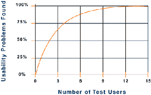
Fig.19: Graph showing approximately 80% of usability problems will be found after testing with only 5 users [53].
For those designing WWW interfaces the work of Nielsen has much to offer, particularly because his findings are mostly based on hard research. His books and web sites [54,55] are a mine of information on searching behaviours; menu design; reading patterns; and good practice for those involved in e-commerce [56]:
"The Web exposes your company to the customer in a software form. The site becomes your sales force, marketing material, service support, and storefront. If your design is not easy to use, nobody is going to do business with you. Customers will soon have hundreds of millions of other Web sites to which, at the click of a mouse, they can go. The burden of going elsewhere is very low on the Web, which means that the requirement for utter simplicity and ease of use in design will go up dramatically."
Clearly this will be true for online school and as such remains good advice. However, as we have seen previously, a strict adherence to Nielsenism tends to result in dull, text-heavy, and rather non-interactive pages. As much as anything else this should lead us to question what we actually mean by a 'usable' interface.
We could begin by saying what it is not: usability does not necessarily mean "easy to use"[57]:
"The user-friendly computer is a red herring. The user friendliness of a book just makes it easier to turn the pages. There's nothing user-friendly about learning to read."
Almost synonymous with this, so-called user-friendly software is often described as having an intuitive interface. In reality this simply means software that uses familiar routines. As Raskin points out, this can actually work against an efficient interface: he cites examples where software vendors have rejected a markedly superior (but unfamiliar) interface design in favour of one that more closely follows the existing paradigm [58]. Norman sums up this area well [59]:
"The notion that design can render anything "intuitively obvious" is false. In fact, intuition is simply a state of subconscious knowledge that comes about after extended practice and experience. With minor exceptions, things that we call intuitive are simply skills that we have practiced for so many years that we no longer recall how difficult it was to learn them in the first place. Skills such as using a pencil, driving an automobile, speaking and understanding language, reading and writing: All these are intuitive to the skilled adult, yet all took years to learn. Difficult tasks will always have to be taught. The trick is to ensure that the technology is not part of the difficulty."
So given this, can we describe the characteristics of a usable interface? In terms of what has already been discussed here, we could initially say that it should allow fluent and meaningful communication to occur between the human user and the computer: a dialogue. Further, we have talked of the direct manipulation of objects in an information space, and this in turn leads naturally to the discussion of navigation through this space. Users will need to learn how to move through the space, and they will need to know where they have been and where they are going: perhaps we could say that the interface needs to present a vivid and accurate mental model of the information space [60]:
"Mental models are not just static; they function. That is, they represent not only configurations but also dynamics. Through motions, they reveal structure and mechanism. Thus a mental model can represent how it actually works, or is set up."
Then, if an interface represents itself to the user in this way we begin to approach a level of engagement that we might accurately term interactive. This is actually a very difficult concept to pin down, but Laurel [61] suggests that a fundamental feature of this is that the user feels herself involved in the representation, feels herself participating.
This leads us to the conclusion that the interface must work successfully in two fundamental ways. Firstly, it should allow the user to complete their tasks efficiently and well. Secondly, that an environment must be created that allows this to be done in a way that is emotionally satisfying for the user [62]:
"Better human-computer interfaces improve our sense of participation. Good software designs engage us with a credible representation of a world in which we work. They let us know we are in charge, and they let us focus on our work. Like good traditional tools, they go unnoticed. We may say they become transparent."
By these standards, very few current interface designs are successful: they are far too intrusive [63]:
"An excess of perceptual load prevents us from finding tools to be transparent or actions to be continuous. Distraction interferes with the participatory practice of talent."
All of which suggests that Nielsens equation—utter simplicity = usability—does not begin to tell the whole story. Simplicity is desirable, yes, but is often incompatible with the complexity and power of our current software tools and with the extent of the WWW. Ultimately, a truly successful interface design may depend on more than usability metrics, a good understanding of the psychological processes at work, and a well designed information architecture [64]:
"Beauty is important in engineering terms because software is so complicated. Complexity makes programs hard to build and potentially hard to use; beauty is the ultimate defense against complexity."
Beyond the Desktop
In the face of novelty we humans will most likely grasp at metaphor: that is, a technique we use for describing things we don't understand in terms of something we do understand. We do it all the time. The car becomes a horseless carriage; the internet becomes a web; a screen of information becomes a page, the information space a desktop. The origins of the desktop interface derives—as we have seen—largely from the research at Xerox PARC. With the Star, in particular, they were specifically designing a machine for inexperienced computer users within a business environment [65]. The progression form the Alto's stack of papers through to a fully-fledged office simulation must have been irresistible. Certainly, as it became implemented on the Macintosh, the desktop metaphor achieved a high level of sophistication and elegance.
However, simply by looking a text document it is apparent that the behavioural similarities between the paper version and its metaphoric icon are actually very few. The problem with metaphor, then, is that it usually only holds up under strictly limited conditions, and the more complex the object you are trying to describe the less useful a metaphor is likely to be [66]:
"True, where the properties of the metaphor and the new thing are closely related, the metaphor helps in acquiring those properties. But when they differ, the metaphor can get in the way of learning; it either provides the wrong model or it slows up acquisitions of the correct one."
Gelertner describes this dissonance between the real and metaphoric objects as paradigm drag [66]. In the real world desktops are rarely fitted with windows, and as Ted Nelson has said [67]:
"…I have never personally seen a desktop where pointing at a lower piece of paper makes it jump to the top, or where placing a sheet of paper on top of a file folder causes the folder to gobble it up. I do not believe such desks exist; and I do not think I would want one if I did."
However, with the vast information spaces now represented on the WWW it would seem that the days of the desktop metaphor as a single dominant paradigm are drawing to a close. In the past couple of years a wide variety of new interfaces have appeared that attempt to address the problem of navigating this new domain. Some of these are simply new browser types, designed specifically for navigating WWW data but running within existing operating systems. Others address the issue in more fundamental ways that tend to erase the distinction between local or personal data—on the users own machine—and that distributed across the WWW.
Treemaps were developed by a team at the University of Maryland under the guidance of well-known HCI researcher and author Ben Schneiderman. Recent implementations have the data—the contents of a hard drive, say—presented as a grid, with different file types and attributes represented by different size blocks, colour-coding etc. [68].
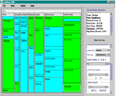
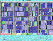
Fig.20: Treemaps representing different data arrays [69].
Lifestreams is a project developed by Eric Freeman and David Gelertner. It aims to present your life online as a continuous stream of documents where file types become largely irrelevant. Images, movies, phone-messages, electronic newspaper 'clippings', whatever… You can move into the past and select any document you have ever created at any time (they are each tagged to aid identification and a summary view of each one can be called up). You can create new substreams representing particular projects or file types: you could create a substream showing all your e-mails or sound files, for example.
The idea is that this would all be stored on a secure server somewhere and that you could access it at any time, from anywhere, and on any device. Clearly, this would depend upon the formation of vendors operating warehousing facilities, and brings up other questions of long-term security and privacy: what if they lost it all, or some outsider hacked their way in to your data? A fuller description of all this can be found in [70].
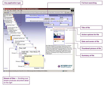
Fig.21: Lifestreams. From [71].
Xerox PARC have been doing much in this area, and their site has details of many different types of new interface formats [72]. They have also formed a new software development company—Inxight—marketing their Hyperbolic Tree browser. The trial version of this presents a supermarket shopping scenario. As the sub-sections are accessed the 'spider' expands to show the products. Not revealed in the diagrams below are two subsidiary panes showing prices for each item—including special offers and bulk buy prices, etc.—and a running total as you put items in your basket [73]:
Fig.22: Start page of Inxight shopping experience demo using the Hyperbolic Tree. Note tool bar to the left [73].
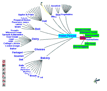
Fig.23: Expanded tree. Much fiddling was done to gain this view! Note overlap of categories [73].
I have discovered two other new graphical displays for WWW spaces: both of theses are commercial products that rely on a freely downloadable browser 'plug-in'. Unfortunately, because neither had Mac versions available I was unable to use either of them.
Fig.24: Web Brain, from www.thebrain.com. This image from [74].
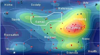
Fig.25: Web Map,from www.webmap.com. This image from [75].
The WebMap visualisation of WWW information space is very easily understood, relying on our previous knowledge of land maps: where colour coding denoted elevation, it now shows density of activity. These types of enhanced colour images are also common for presenting fMRI scans, rainfall patterns, and mathematical data, for example: could maps replace the desktop as the central interface metaphor?
The WebMap is also interesting in that it is a Zooming User Interface (ZUI): in the image above we can see that the 'games' area is highlighted. The map will then zoom in on this section, magnify it, to allow more detail to be shown of particular areas of interest. Raskin spends some time discussing ZUIs—he calls them Zooming Interface Protocols (ZIPs)—and describes a system developed for use in a hospital. Starting at the level of granularity of an individual patient's records, users can zoom out to successively see the individual beds in a particular ward, the floors of the building, the campus, and then the WWW. Users are able to create, modify, and affix new documents or files as they move around the space [76]:
"To see more of ZoomWorld, you think of yourself as flying higher and higher above it. To look at a particular item, you dive down to it. ZoomWorld also has a content searching mechanism. The overall metaphor is one of flying, climbing to zoom out and diving to zoom in."
These examples represent a small sample of the new interface types now being developed. An overview of the diversity of research being carried out on these interfaces, including detailed descriptions of the many projects at Xerox PARC I mentioned earlier, can be found in [77]. However, any exploration of the WWW as it now stands will uncover literally hundreds of new interfaces already in use. Navigation scheme metaphors range from calendars, aircraft seating plans, Star Trek-like control widgets, and trips down rivers, through to all manner of immersive 3D environments. Pages fade in, zoom out, slide down, and pop-up. Some present deliberately difficult navigation schemes involving sound puzzles or mobile icons [78]. Typically these interfaces will be created within such programs as Flash and Director. They allow the designer to assume complete control of the browser; allow the inclusion of sound and movement; allow a high degree of interactivity; and run on a widely-installed plug-in [79].
Discussion
Rather than talk about interface design in terms of screen layout, menu design, icon recognition, or colour-coding, this essay has attempted to present a historical and cultural overview. This has, I think, brought up some very interesting issues.
Firstly, it is apparent that current paradigms for the computer interface have merged out of an already existing technology: print. From Bush's original description of the Memex via the stack of papers on the Alto through to a fully-realised office space on the Macintosh desktop, the document has always figured strongly. Even when the personal computer became integrated into the WWW this paradigm remained: the hypertextual nature of the internet is fundamental to its structure. HTML is derived from SGML: it is a page description language.
Having said that, it is becoming apparent that the content of the WWW is changing. Where pages once held only text, images, sound files, and movies are now all commonplace. In fact, what we are seeing is a process whereby all our cultural products are available through the internet and, therefore, presented to us through the interface. As Englebart realised, this essentially becomes a problem of linguistics: the interface has to deal simultaneously with the languages of cinema, print, radio, and music. Manovich has described these existing technologies as becoming liberated from their traditional storage media [80]:
"No longer embedded within particular texts and films, these organizational strategies are now free floating in our culture, available for use in new contexts. In this respect, the printed word and cinema have indeed become interfaces — rich sets of metaphors, ways of navigating through content, ways of accessing and storing data. For a computer user, both conceptually and psychologically, their elements exist on the same plane as radio buttons, pull-down menus, command line calls, and other elements of the standard human-computer interface."
For Manovich, the computer interface has become a cultural interface [81]:
"In short, we are no longer interfacing to a computer but to a culture encoded in a digital form."
This leads directly on to my second point, that of literacy. We left Alan Kay at the point where he had gone off to develop some way to allow computer users to manipulate symbolic systems, where this was seen as the final stage in the mastery of a domain: free manipulation of symbolic rules in turn being strongly related to creativity. Clearly within the context this discussion takes place—online distance learning—these kind of ideas are particularly relevant. The point is this: in a print culture we would not consider someone literate if they could not write. By extension, we should expect someone who is computer literate to be able to express thought and manipulate ideas in a culturally negotiable way. How do we define literacy in this sense?
Perhaps we could start by considering the humble word processor. Certainly it allows the expression and shaping of ideas. It permits cut-and-paste editing, and lets the user integrate images, tables, and diagrams. Although in some ways it is little more than an electronic handwriting machine, the new functions offered within the digital domain greatly extend the possibilities of pen and paper (or a typewriter). We could further extend this idea to include the creative use of applications like Illustrator and Photoshop, music programs like Logic and Cubase.
Or is this missing the point? In each of these cases creativity is mediated by a pre-packaged and pre-defined set of tools. Perhaps true computer literacy only comes with the ability to manipulate symbols at a more fundamental level. It may be that this question can only be answered by the individual. Certainly, in my own mind I am very aware of the limitations and constraints imposed by commercial products. Despite their flexibility and range these programs have powerful affordances that tend to pull diverse creative impulses down the same well-worn routes. Consequently, people do feel the need to develop their own softwares, create their own tools.
Possibly the WWW can meaningfully extend our conception of 'computer literacy'. As we have seen it is now possible to create complex and dynamic multimedia environments on the internet, and programs such as Flash and Director allow the user to combine media from different sources very freely. And of course, the WWW being what it is, individuals can 'publish' their creations. They can write.
Of course underlying this discussion is the recognition that our thinking is changed by the way we represent data. In the Context essay I said that many types of information could be derived from one set of data. How that information is represented to us—text, image, movie, sound—will to a large part determine how we interpret it, what we learn about it. In turn, the way in which we are able to express our new knowledge and represent it to others will depend upon the tools we have at our disposal. In other words, representation and understanding exist in a feedback loop with our tools—the interfaces of operating systems and applications—intermediating at each turn.
References
1) Bernard Suzanne "Characters of Plato's Time and Dialogues; Simonides"
http://phd.evansville.edu/tools/char/simonide.htm (8.8.01)
2) Donald Kunze "Simonides and the Art of Memory"
http://art3idea.ce.psu.edu/boundaries/basics/cc_simonides.html (8.8.01)
3) Thomas Bulfinch, The Age of Fable Vols l & ll, XXV.c Simonides
http://www.bartleby.com/181/253.html (8.8.01)
4) David Samuel, Memory (Phoenix 1999) p.61
5) Margaret Wertheim, The Pearly Gates of Cyberspace (Virago 1999) p.80
6) Eleonora M. Beck "Marchetto da Padova and Giotto's Scrovegni Chapel Frescoes in Early Music Vol XXXVII/I (February 1999)
7) Albert Kapr, Johann Gutenberg (Scolar Press 1996) p.114
8) Brian L. Silver, The Ascent of Science (Oxford University Press 1999) p.14
9) Kapr, op cit, p.288
10) Vannevar Bush "As We May Think" in The Atlantic Monthly (July 1945)
http://www.theatlantic.com/unbound/flashbks/computer/bushf.htm (9.8.01)
11) Bob Hughes, Dust or Magic (Addison-Wesley 2000) p.31
12) John Naughton, A Brief History of the Future (The Overlook Press 2000) p.55
13) Hughes, op cit, p.35
14) Doug Englebart "Augmenting Human Intellect: a Conceptual Framework"
http://www.histech.rwth-aachen.de/www/quellen/englebart/Ah262.pdf (8.9.01)
15) Lev Manovich, The Language of New Media (MIT Press 2001) p.64
16) "Current Interpretations of the Whorf-Sapir Hypothesis"
http://www.geocities.com/CollegePark/4110/whorf.html (10.8.01)
17) James Reston, Jr., Galileo: A Life (Cassell 1994) p.92
18) Steven Johnson, Interface Culture (HarperEdge 1997) p.22
19) Adele Goldberg "Excerpts from a Personal History of Workstations"
http://www.bootstrap.org/institute/augdocs/augment-101931-add.htm (10.8.01)
20) http://www.bootstrap.org/chronicle/curatorial/hist_pix/t30.jpg
21) http://www.bootstrap.org
22) Stuart K. Card "Pioneers and Settlers: Methods Used in Successful User Interface Design" in Rudisill, Lewis, Polson, & McKay (Eds), Human-Computer Interface Design (Morgan Kaufman 1996) p.128
23) Alan Kay "User Interface: A Personal View" in Brenda Laurel (Ed) The Art of Human Computer Interface Design (Addison-Wesley 1990) p.192
24) Miller & Johnson "The Xerox Star: An Influential User Interface Design" in Rudisill, Lewis, Polson, & McKay (Eds), Human-Computer Interface Design (Morgan Kaufman 1996) p.74
25) David Gelertner, The Aesthetics of Computing (Weidenfield & Nicholson 1998) p.69
26) Johnson, op cit, p.47
27) Kay, op cit, p.193
28) Kay, op cit, p.195
29) Jerome Bruner, Towards a Theory of Instruction (Belknap Press 1966) p.10
30) Kay, op cit, p.195
31) Kay, op cit, p.197
32) Miller & Johnson, op cit, p.74
33) Miller & Johnson, op cit, p.77
34) Miller & Johnson, op cit, p.71
35) Stuart K. Card, op cit, p.148
36) Miller & Johnson, op cit, p.71
37) Alison Head "A Question of Interface Design: How Do Online Service GUIs Measure Up?" from Online Magazine (May 1997)
http://www.onlineinc.com/onlinemag/MayOL97/head5.html (30.7.01)
38) Donald A. Norman, The Design of Everyday Things (MIT Press 1988) p.181
39) Stuart K. Card, op cit, p.122
40) Robert X. Cringely, Accidental Empires (Viking 1992) p.189
41) Gelertner, op cit, p.76
42) Donald A. Norman, The Invisible Computer (MIT Press 1998) p.216
43) Alison Head, Design Wise (CyberAge Books 1999) p.23
44) http://cardean.e?e_suite/iue_1zen/content/lr_iterative.htm
45) Miller & Johnson, op cit, p.80
46) Norman (1998), op cit, p.216
47) Norman (1998), op cit, p.222
48) Cringely, op cit, p.87
49) Card, Moran, & Newell, The Psychology of Human-Computer Interaction (Lawrence Erlbaum 1983) p.144
50) Card, Moran, & Newell, ibid, p.27
51) Atwood, Gray, & John "Project Ernestine: Analytic and Empirical Methods Applied to a Real-World CHI Problem" in Rudisill, Lewis, Polson, & McKay (eds), Human-Computer Interface Design (Morgan Kaufman 1996) p.101
52) Jacob Nielsen "Heuristic Evaluation"
http://www.useit.com/papers/heuristic/ (13.8.01)
53) Jacob Nielsen "Why You Only Need to Test With 5 Users"
http://www.useit.com/alertbox/20000319.html (13.8.01)
54) http://www.useit.com/
55) http://www.nng.com/
56) Head (1999), op cit, p.36
57) Tod Newcombe "Expression and Interface: An Interview with Alan Kay" from GovTech Magazine (Feb 1998)
http://www.govtech.net/magazine/visions/feb98vision/kay.phtml (12.8.01)
58) Jef Raskin, The Humane Interface (Addison-Wesley 2000) p.151
59) Norman (1998), op cit, p.182
60) Malcolm McCullough, Abstracting Craft (MIT Press 1996) p.148
61) Brenda Laurel, Computers as Theatre (Addison-Wesley 1993) p. 20
62) McCullough, op cit, p.139
63) McCullough, op cit, p.140
64) Gelertner, op cit, p.20
65) Miller & Johnson, op cit, p.71
66) Gelertner, op cit, p.81
67) Theodor Holm Nelson "The Right Way to Think About Software Design" in Brenda Laurel (Ed) The Art of Human Computer Interface Design (Addison-Wesley 1990) p.237
68) Sami Lais "Treemaps Bloom" in Computerworld Magazine (July 2, 2001)
http://www.computerworld.com/cwi/stories/0,1199,NAV47-68-84-
91_STO61776,00.html (10.7.01)
69) Treemaps Home Page
http://www.cs.umd.edu/hcil/treemaps/treemap2001/ (10.7.01)
70) Gelertner, op cit, ch.5
71) http://www.scopeware.com/home_ns/index_flashns.htm
72) http://www.parc.xerox.com/parc-go.html
73) http://www.inxight.com/demos/grocery/index.htm
74) http://ourworld.cs.com/_ht_a/tcmits1/img/brain_demo.gif
75) http://www.webmap.com/images/faq_map.jpg
76) Raskin, op cit, p.153
77) Card, MacKinlay, & Schneiderman, Readings in Information Visualisation (Morgan Kaufmann 1999)
78) A good place to start exploring would be these design site directories:
http://www.linkdup.com/
http://www.moluv.com/moluv3/index.html
http://www.finddesign.com/
79) According to Macromedia the Shockwave plug-in is installed on 97.6% of all online users machines.
http://www.macromedia.com/software/flash/
80) Manovich, op cit, p.73
81) Manovich, op cit, p.70
Copyright Paul Hazel 2001