CD artwork templates
Download some templates to
help you create CD inlays,
booklets and labels ...
Function of a grid
Grids are used for several reasons ...
- To impose an organised structure on the text and images.
- To guarantee layout consistency between multiple pages in a document.
- To guarantee layout consistency between products in a series (such as books or labels).
- To function as a common layout reference for all personnel involved in the various stages of production.
- To accommodate the requirements of the printing and finishing processes by specifying printing and non-printing areas and finishing instructions such as fold, scoring, perforation and trim marks.
Almost all multimedia authoring, web site design and DTP programs allow you to define a background grid to which you can align your various elements (text, boxes, images, nav bars etc). Typically you will be able to define the distance between horizontal and vertical lines and the colour between them.
You should always consider your grid very carefully. Once you have decided upon it and started to build your project screens, it is time consuming to change it. This is why storyboarding is so important.
Dreamweaver's grid settings dialogue box
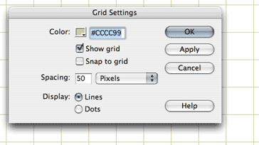
Grids for multimedia / web design
Most applications allow you to define and display a grid. You will normally find settings in Preferences or View menus.
If you plan to use Photoshop and Dreamweaver to build your interface, you should create identical grids in both and use "snap to grid" to align your elements.
Grids in web design
To some extent, using CSS to control layout has made the use of grids less important in web design, but you may still find it useful in deciding the initial positions of your <div> tags and other positional elements.
The spacing of your grid lines can be arrived at by dividing your overall project/screen size into usable integer multiples.
Grids for graphic design / artworks
Elements of a grid for graphic design/print layout
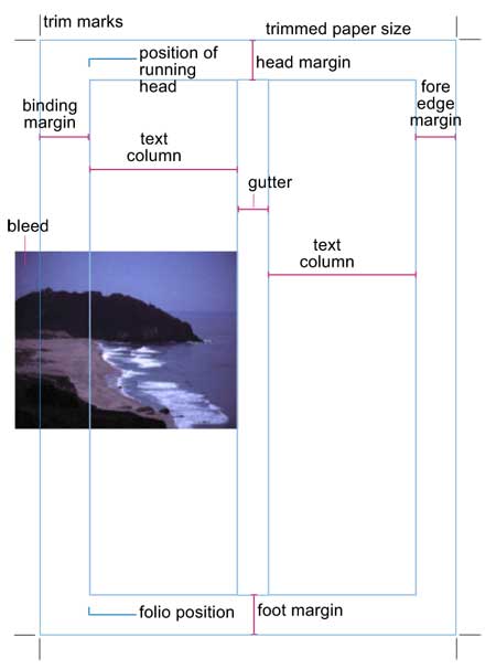
Grids are usually used to position and show all the elements common to multiple pages documents but are also used for single page documents. Grid elements include ...
- Trim and perforation marks
- Fold and score marks
- Margins
- Bleed areas
- Column widths
- Gutters
- Positions of headlines
- Position of chapter headings
- Position of hanging indents
- Position of image captions
- Positions of folios (page numbers)
- Position of text boxes (frames)
- Position of image boxes (frames)
- White space (print areas left unused)
Constructing a grid
It is crucially important that the grid is right and thus designers and their clients, with the technical consultation of printers and print finishers, will often spend a considerable time fine tuning a grid.
Prior to computer DTP, grids were either printed onto art card (for multiple production jobs) or drawn individually by designers onto "paste-up" boards in light blue ink or pencil, a colour which didn't show up when an artwork was photographed during plate making. Today's DTP layout applications provide tools for creating non-printing grids which can be made visible when necessary and to which text and images boxes and frames may be "snapped" or aligned.
There are several stages in the construction of a grid ...
- Determine paper (document page) size
- Specify the trim, perforation, fold and score marks
- Specify the head, foot, binding and fore edge margins in order to determine the print area
- Divide the print area into columns, header and foot areas
- Specify the positions of folios and running headers (such as chapter headings)
Paper sizes
Paper sizes may be specified by referring to the ISO (International Standards Organisation) series of paper sizes. The ISO has been responsible for standardising a number of elements common to publishing.
The following are the standard metric paper sizes in common use today ...
- A0 841 x 1189mm
- A1 594 x 841mm
- A2 420 x 594mm
- A3 297 x 420mm
- A4 210 x 297mm
- A5 148 x 210m
- A6 105 x 148mm
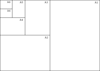
There are also SRA sizes which are basically oversize paper sizes allowing for trimming back to the A sizes where images have been laid out to bleed over the edge of a page.
Master pages
DTP page layout applications allow a user to create so called Òmaster pagesÓ. Designers place their grids, and elements common to all pages (such as page numbers and ruled lines), onto these master pages and then generate document pages from them.
Several different master pages may be generated for different document sections such as ...
- Title page
- Contents page
- Main body / chapter pages
- Advertisement pages
- Classified advertisement pages
- Bibliography pages
- Index / glossary pages