It is essential for all print and multimedia designers to have a firm grasp of both the technicalities and aesthetics of typography if they are to successfully deliver a message.
Typeface / Font distinction
A typeface is the individualistic designed look of the shape of the characters. A typeface designer designs a typeface.
Once a typeface has been designed, it must be turned into something "physical" so that it can be employed to style, display and print the written word. A font is the "physical" realisation of a designed typeface. The distinction between a font and a typeface is an important one for designers to understand, especially as the two terms are often mistakenly used in the incorrect context.
The definition of font has changed somewhat since the introduction of digital typography. In the days when fonts were made of metal they were kept in individual cases sorted according to style, weight and size. For example Gill San 10pt would be kept in one case and Gill Sans 12pt another.
![]()
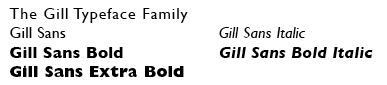
Today fonts are stored on a computer system as digital data files. Because an individual font can be employed at various sizes we can no longer call each size an individual font. However, we should still refer to the individual styles and weights of a typeface as individual fonts. Together they comprise a Typeface Family.
The Gill Typeface Family, for example, comprises ...
For an in-depth discussion of Fonts see the accompanying article Fonts.
Character
A character is a single letter, number or symbol.
Letterform
The term "Letterform" refers to the designed shape of each character.
Type anatomy
A comprehensive vocabulary of terminology describes all the elements of a letterform.
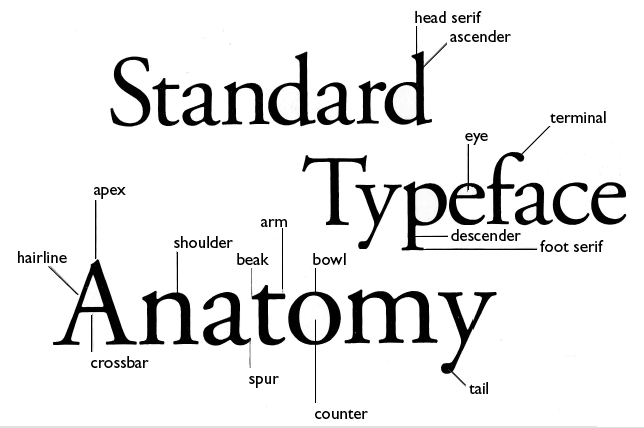
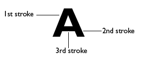
Stroke
The most important element of a letterform is the Stroke. For example, the capital letter A is comprised of three strokes. Typographers have developed a complex vocabulary to identify the various strokes that comprise a letterform.
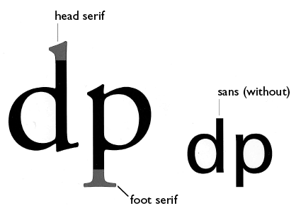
Serif
When text was written using ink and a brush a stroke would often end with a blob or drip of ink as the brush was lifted from the paper. This effect was integrated into writing styles and the Serif was developed as a formal way of ending a stroke. Today a Serif implies craftsmanship. Use a serif typeface when you want to imply traditional conservatism in your message.
Type proportions
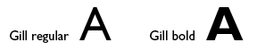
Weight
The weight of a character is determined by the thickness of its strokes in relationship to its overall height. Most typefaces are designed in two weights, regular and bold.
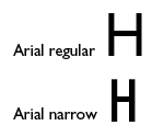
Width
The width of a character is determined by the size of the space between its vertical strokes. Terms to describe width include Regular, Narrow, Condensed, Extended.
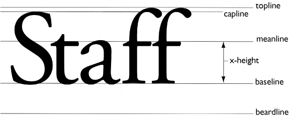
Staff
Like notes on a musical stave, the way letterforms "sit" can be analysed by imposing a so called "staff" of horizontal lines.
Metrics
Sizing
In order to allow the precise measure of small type sizes the Point system of measurement was introduced by type designers in the 17th century.
A single Point is equal to 0.3515 millimetres There are 72 points in an inch. This matches the 72 dpi resolution of computer displays. Therefore type at 72 point should measure 1 inch from its lowest descender to its highest ascender. 12 points together are called a Pica.
Spacing
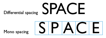
Spacing refers to the horizontal space each character in a typeface requires. Because different characters have different widths Differential Spacing adjusts the gaps between characters accordingly. Mono spacing gives each character the same space regardless of width.
Tracking
Tracking refers to uniformly adjusting the spacing between all the characters in a word, sentence or paragraph.
![]()
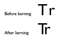
Kerning
Kerning is the process of manually adjusting the individual space between two adjacent characters.
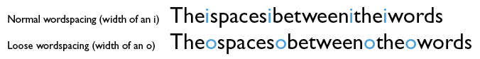
Word spacing
Word spacing refers to the amount of space between words in a sentence.
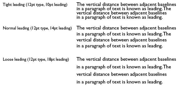
Leading
Leading is the vertical distance between adjacent lines of type in a paragraph. The exact leading value is often determined by the line length. Longer lines require greater leading to allow the eye to find the next line as it moves back and down.
Leading is usually expressed in Points. A simple rule is to add 2 to the type point size to determine the leading value. A type size of 12pt typically requires a leading value of at least 14pt.